MORE
MOREGoogle Updates the Allegedly Drab Sign-in Page with A Contemporary Design
By Consultants Review Team

 Google is updating the look of its sign-up and sign-in pages, adding a contemporary element consistent with Google Material Design (MD), the company's design language used in all of its other products. Beginning on February 21, 2024, users on web and mobile devices will be able to access the new sign-in page.
Both users with personal Google accounts and Google Workspace clients may use the new sign-in page. This feature does not have admin control or end-user settings; users will immediately notice the updated interface and  enhancements. This new interface is now visible to many people, but it will soon be visible to others as well. Google said that users worldwide are progressively implementing the adjustments. It is anticipated that the functionality will appear on each user's account after a maximum of fifteen days.
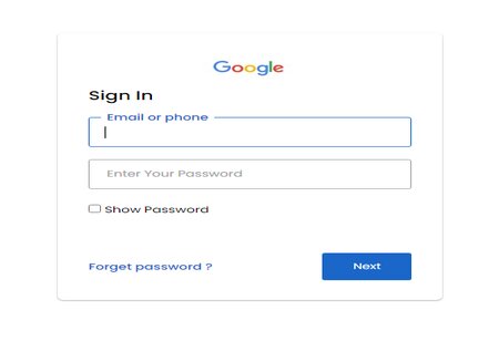
What has changed, though? The new sign-in page, however, has a huge Google logo in the middle of a minimalistic landscape layout. There is a link to reset your password or establish a new account beneath the sign-in form, which is located in the bottom right corner. Users may access their Google accounts more easily from any device thanks to the sign-in page's ability to adjust to various screen sizes and orientations. Google claims that this new interface will provide customers with an easier-to-use and more aesthetically pleasing method to connect with their Google accounts.
However, why the change? Google claims that by utilizing the Material Design language, the business is continuously working to enhance the security and user experience of its products, including this visual update. Material Design is a design framework that uses colors, shapes, typography, and animations to produce a unified and user-friendly experience across platforms and devices. Since 2014, Google has started incorporating Material Design into its products, including Gmail, Photos, Maps, and Assistant.
Google hopes to make its products more streamlined and user-friendly by introducing the Material Design language. Along with keeping the functionality and security consumers depend on, the new interface aims to improve user happiness and streamline interactions.
However, even with the minimalistic and new look, not all users are loving it. Many users who are already seeing the new fresh look are expressing their views on the new sign-up page. Some are praising the new design for being sleek and simple, while others are criticizing it for being bland and boring.
Although aesthetics are sometimes disregarded, some users are so worried about Google's new sign-up page design that they think it may make phishing attempts easier. This apprehension is a result of the new sign-in page's striking resemblance to some phony login sites that hackers construct in order to steal passwords. Google advises users to constantly double-check the sign-in page's URL and search for the lock icon and the "https://" prefix, which denote a secure connection, in order to safeguard themselves.